UI/UX Design
The content of this project is hidden because it is a private project. Please contact me for the password.
The context
Booking.com is a travel site and metasearch engine that collects and lists places around the world to make it easy for users to find and book accommodations when people travel. With hundreds of unique visitors daily, booking.com primary goal is to offer deals and provide booking arrangements to users around the world.
The Challenge
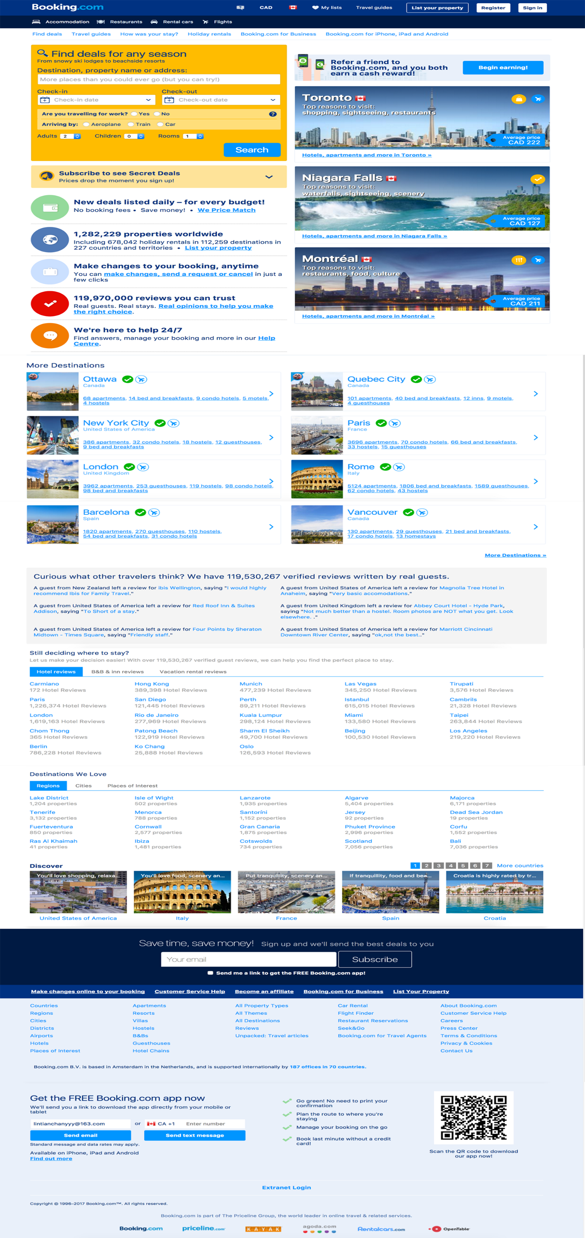
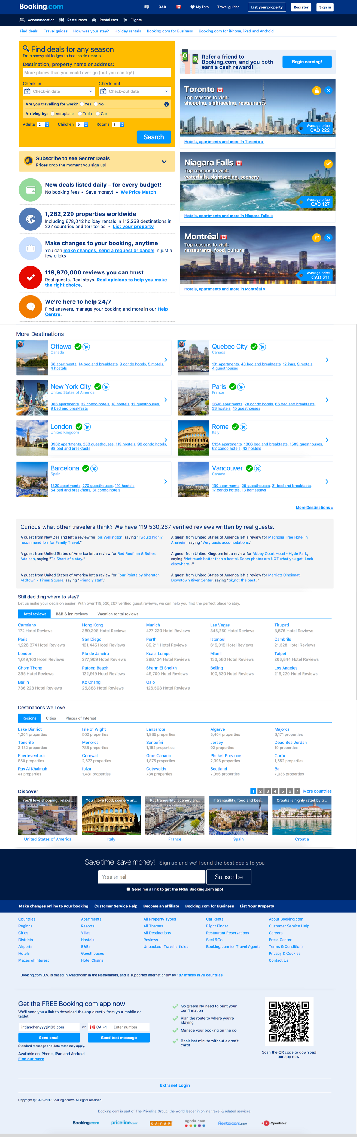
Currently, booking.com carries a complex information architecture. Critical content for some of the major user goals camouflages with an overwhelming amount of content on the page resulting in a negative user experience with the site.
The objectives
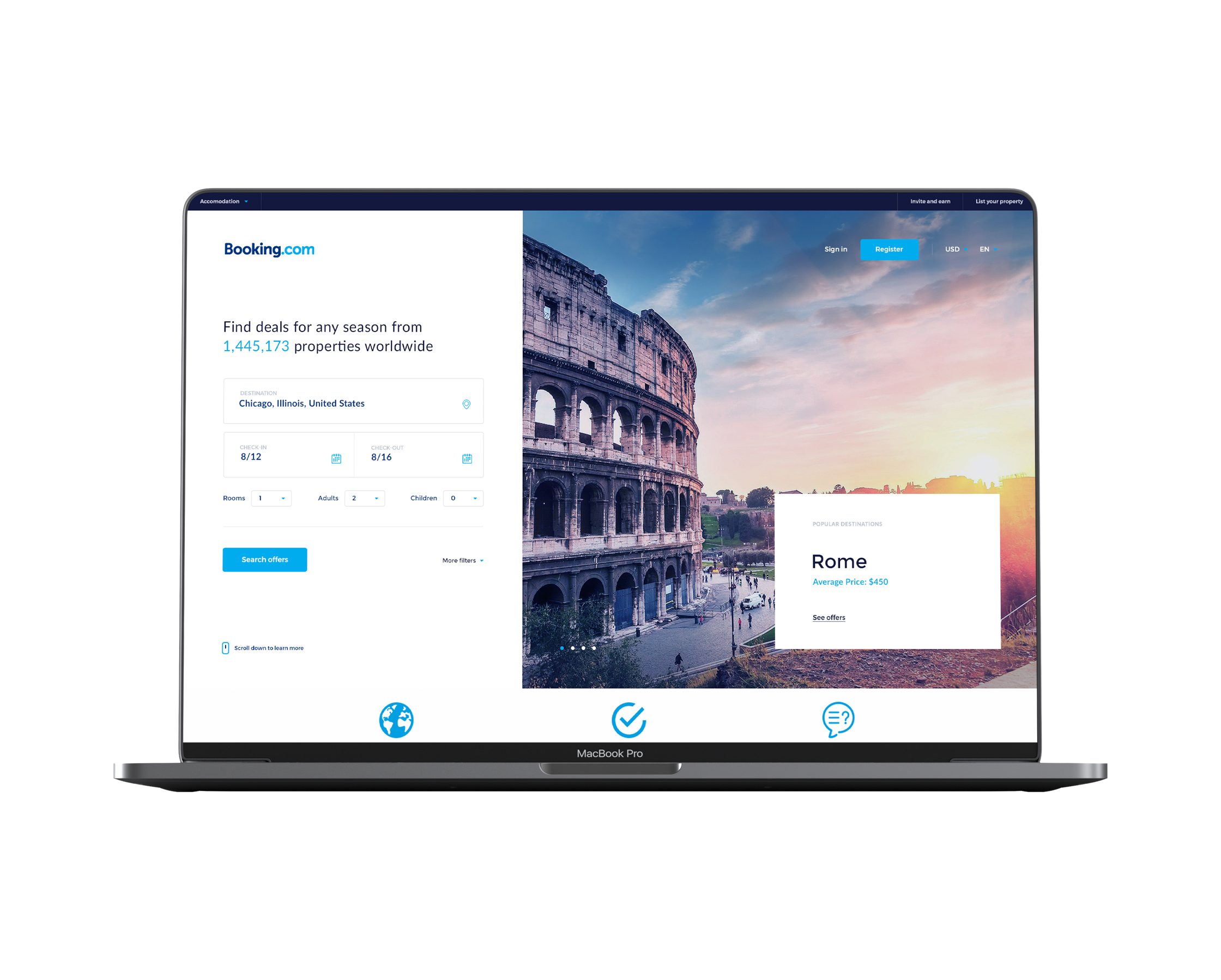
The goal of this project was to rethink and create a more intuitive information architecture using a UX process and analysis so that users can reach their goals and find the information they need with ease. Additionally, I aimed to redesign the user interface for booking.com’s landing page.
The Approach
Information Architecture (IA) is the science of organizing and structuring content on a site. The objective is to organize content so that users would easily adjust to the functionality of the product and could find everything they need without a tremendous amount of effort.
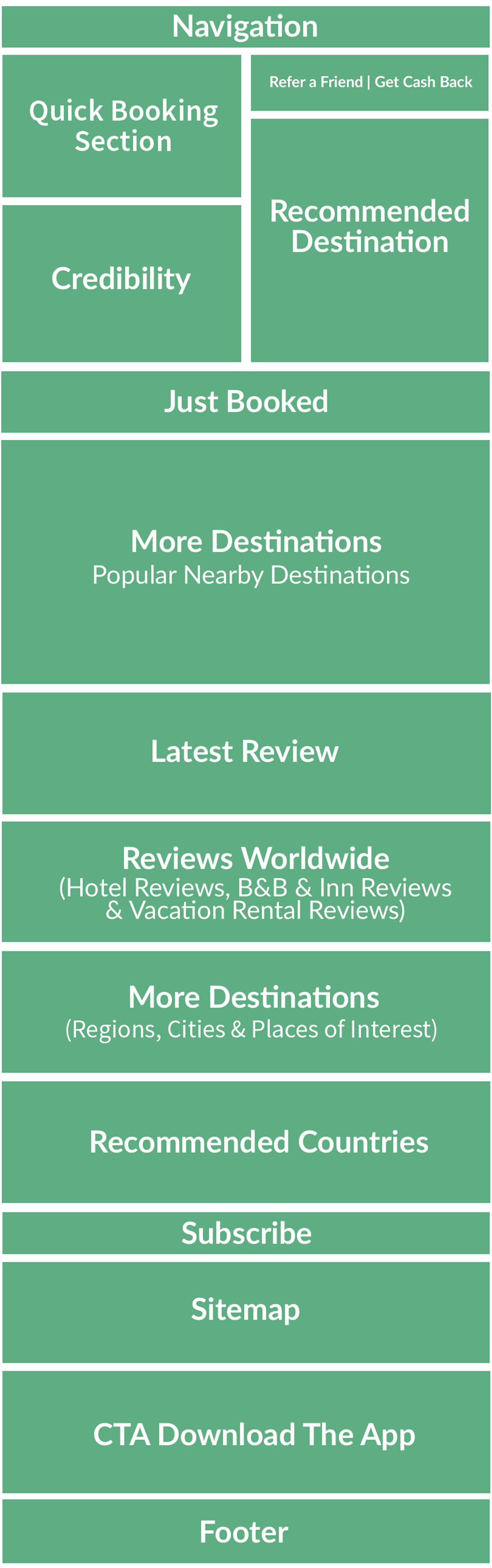
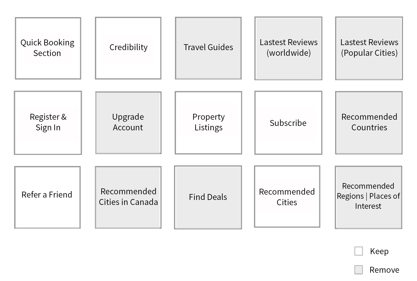
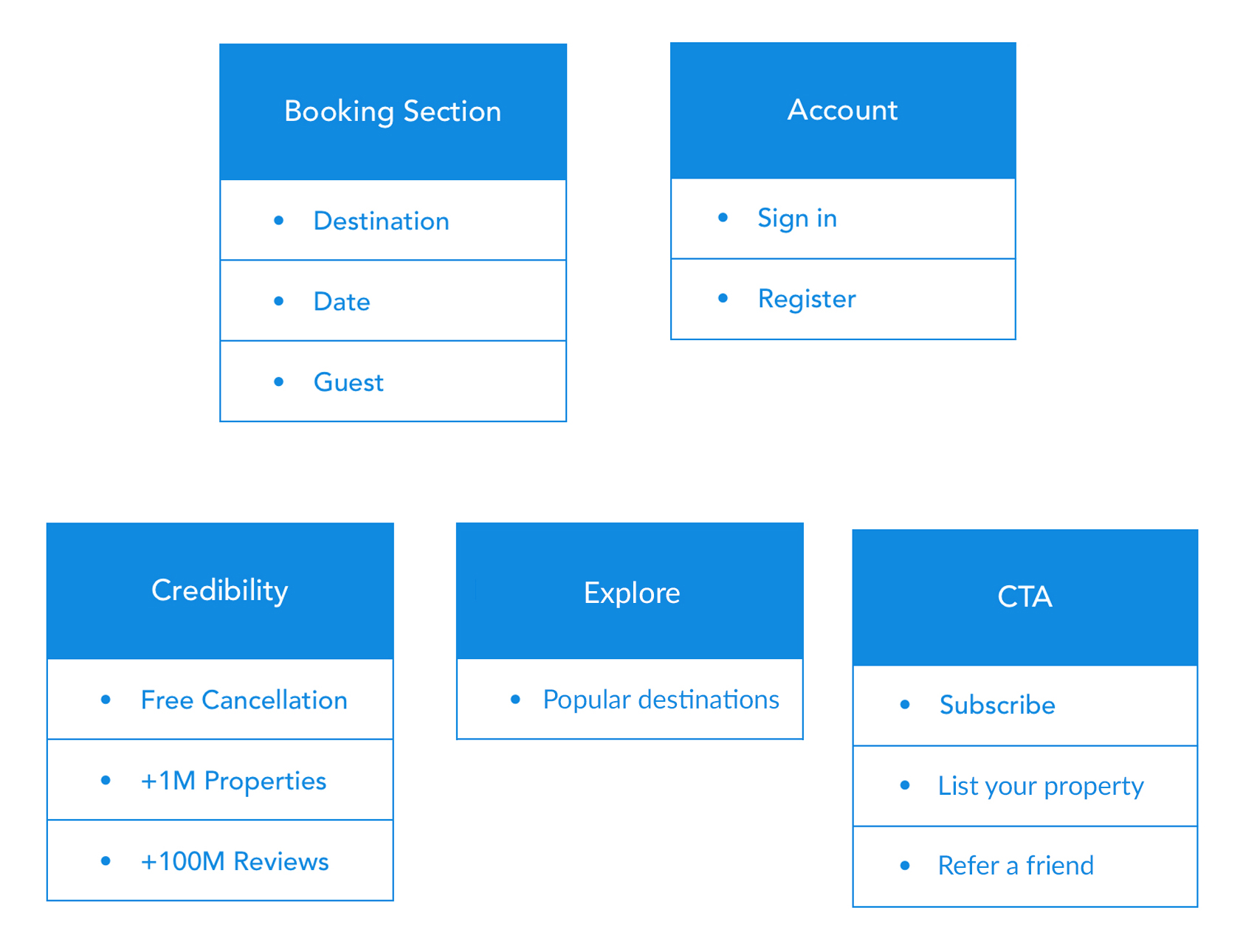
To better understand and visualize the general IA of booking.com's landing page, I mapped out their current content into the following sections. The goal was to collect a list of all the content presented on the landing page.
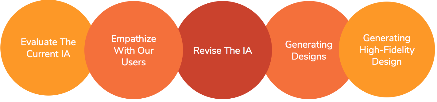
User interviews are a great tool to extract information from users about their experiences and thoughts. The primary goals for this method were to:
1) Understand the user's goals and pain points
2) Evaluate the desktop version of booking.com
3) Revise the information architecture based on the feedback from our users
Pre-Assessment Questions
1) How old are you? An age range is okay.
2) What is your current occupation?
3) How often do you travel per year?
4) How do you find accommodations when you travel?
5) Which is your favorite? Why?
6) Have you ever used booking.com before?
1. If so, what do you like most about it?
2. If so, what do you like least about it?
Landing Page Evaluation
1) What is your first impression?
2) What do you like most about the landing page?
3) What do you like least about the landing page?
4) Do you have anything to add about your experience using booking.com?
Card Sort
1) Could you organize these cards starting with what is most useful to you to view on a travel site's landing page?
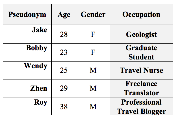
I interviewed 5 participants with the following background:
Overall, the responses to the user interviews were as follow:
1) Participants' ages ranged from 24 - 35 years old.
2) All of the participants traveled at least 3 times or more times a year.
3) Participants confirmed that they use Airbnb, Priceline.com, Booking.com and Expedia for travel accommodations. Interestingly, none of the participants chose booking.com as their favorite.
4) Participants' reasoning for their favorite accommodation sites:
Airbnb: "simple layout", "easy to use", and "provides a delightful overall experience.
Priceline.com: "nice layout", "less clutter", "cheap prices", and "useful filters".
Expedia: "cheap options", "clean layout", "powerful search engine", "easily usable for first time travelers", and "better UX".
5) All participants confirmed that they have used booking.com before. Additionally, 3 out of 5 participants added that they have used booking.com in the last 3 months.
Likes: "Cheap accommodations", "Powerful search engine", "Nice reviews" and "Options".
Dislikes: "Complicated layout", "Confusing navigation", "Misleading content" and "Constant distractions".
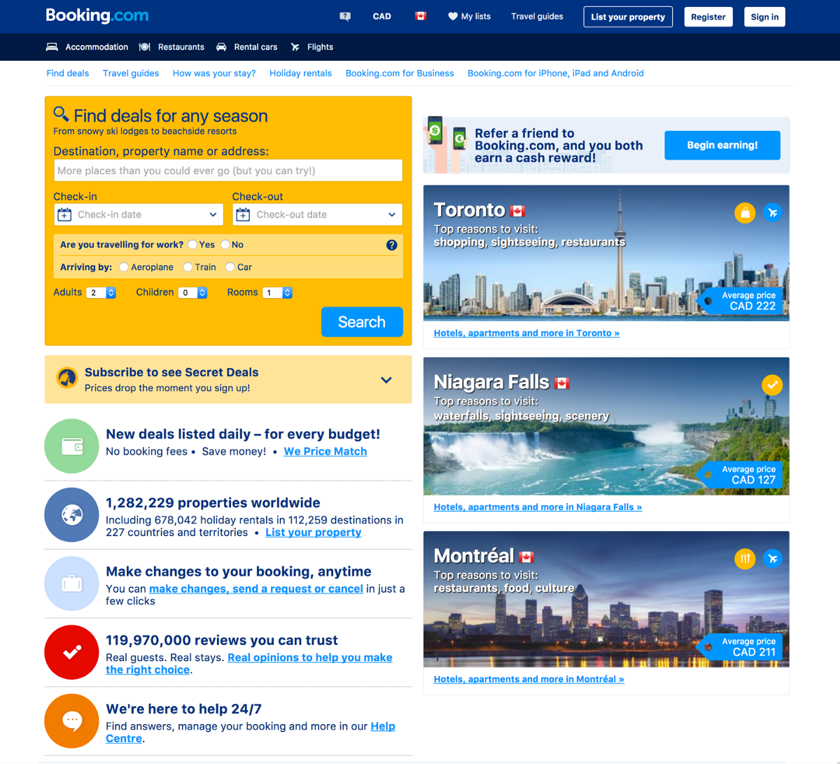
Participants had a chance during the session to evaluate and browse booking.com’s landing page on desktop while observing their behaviors and asking relevant questions.
1) What is your first impression of this page?
Cluttered: "It's (the content) all over the place as I mentioned before"
Wordy: "This page has too much to read!"
Distracting: "I don’t want to see all of the information before I search for it"
2) What do you like most about this landing page?
Quick Booking Section: "This is why I am here for the most part!"
3) What do you like least about this landing page?
1. Three level navigation
2. Too many distractions (graphics and icons)
3. Overwhelming number of links to read
4. Everything camouflages together (Nothing stands out)
5. "Some content looks clickable when it is not"
6. "All the pictures look similar. It doesn't look attractive to press if that is the end goal."
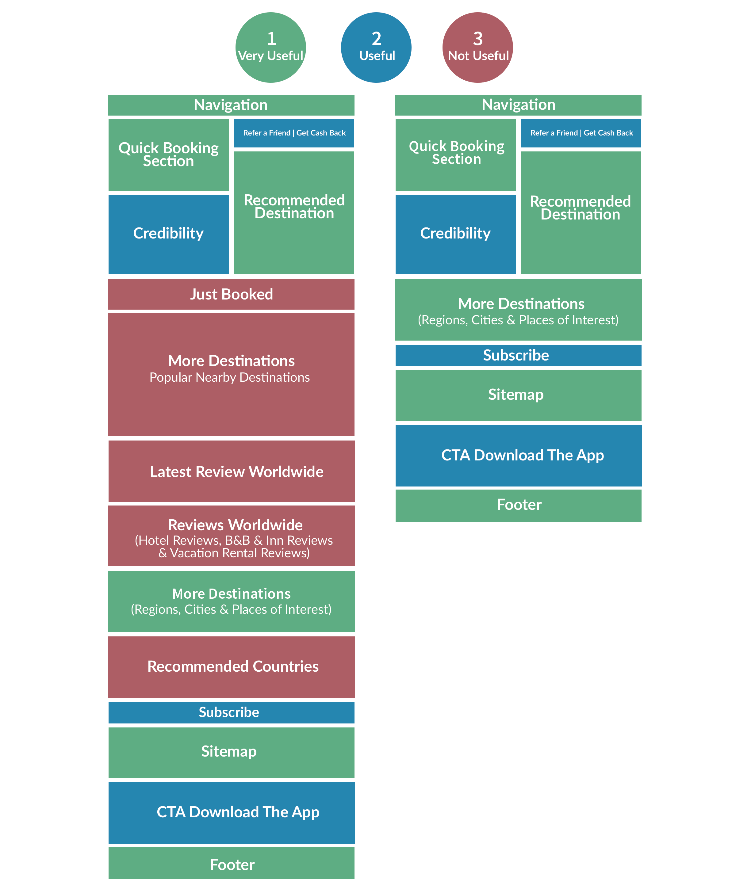
Card sorts are a method used to help design or evaluate the information architecture of a product. During the user interviews, 5 participants organized content items into what was most to least important/useful to them to view on a travel site's landing page.
Outcome: One of the prominent issues with the site is the variety of ways users can view redundant content. These redundant content flows lead to clutter and confusion. The overall result from the card sort is:
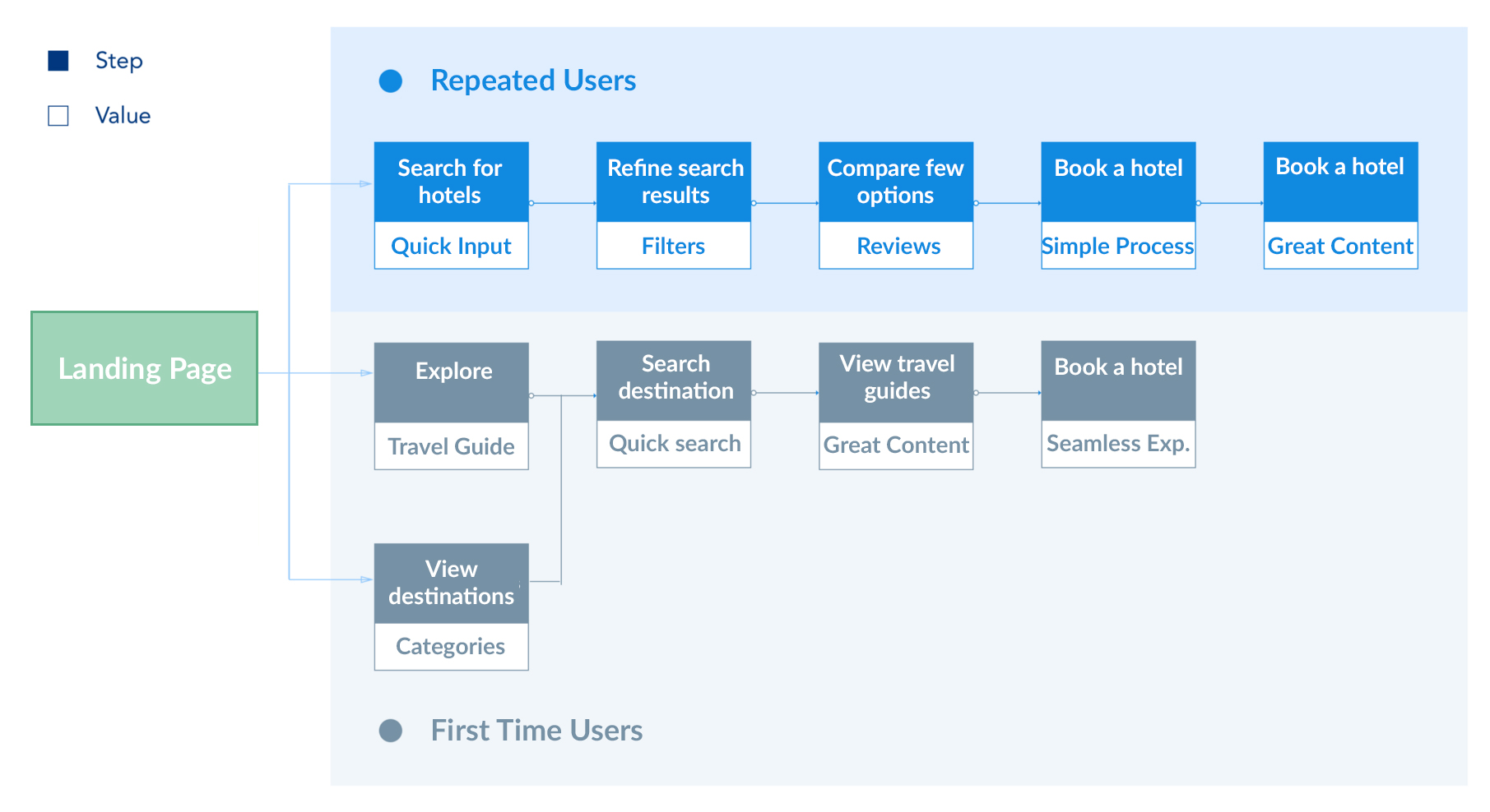
By determining the path user follows through the site, it allowed me to see possible the blueprints of the experience that I can further optimize. Therefore, I ideated on the ideal user flows for booking.com's landing page. As a result, I placed users into two groups according to their different needs.
1) First Time Users: The users who don’t know where to go
2) Repeated Users: The users who know where to go
It is vital to remember that the landing page is a collection of information pieces that is there to serve the user needs. Therefore, I focused on what I plan to remove from the current landing page and why I would like to remove it?
Reviews
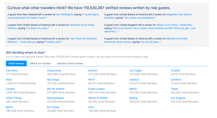
Reviews are only beneficial to the users when they narrow down the results and compare between few options. It is rare that users would click on random reviews on the landing page before even searching.
Call to Actions (CTAs)
CTAs are crucial to marketing success. However, it is not enough to design eye-catching CTAs and place them everywhere. Users will find these CTAs as distracting and out of place. So I made a few changes to the CTAs' placement:
So I made a few changes to the CTAs' placement:
1) "Subscribe to get discount" – When searching/booking accommodations
2) "Refer a friend to get cash back" – After successfully booking accommodations
3) "Download the app" – When using a mobile device
Recommended Destinations
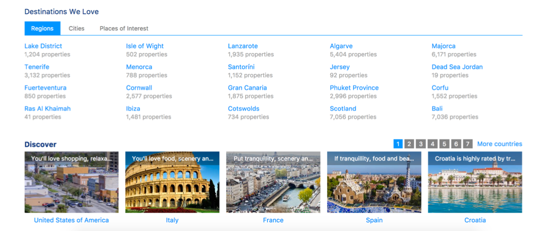
Recommendations can be useful to users who don’t know where to go. However, when users try to explore and click on a recommended destination, do they want to see a list of hotels right away?
I would suggest to place them inside of travel guides. Booking.com has a fantastic travel guides page where you can find great information of a destination, like “Things to do”, “Best times to visits”, “Average prices” and more.
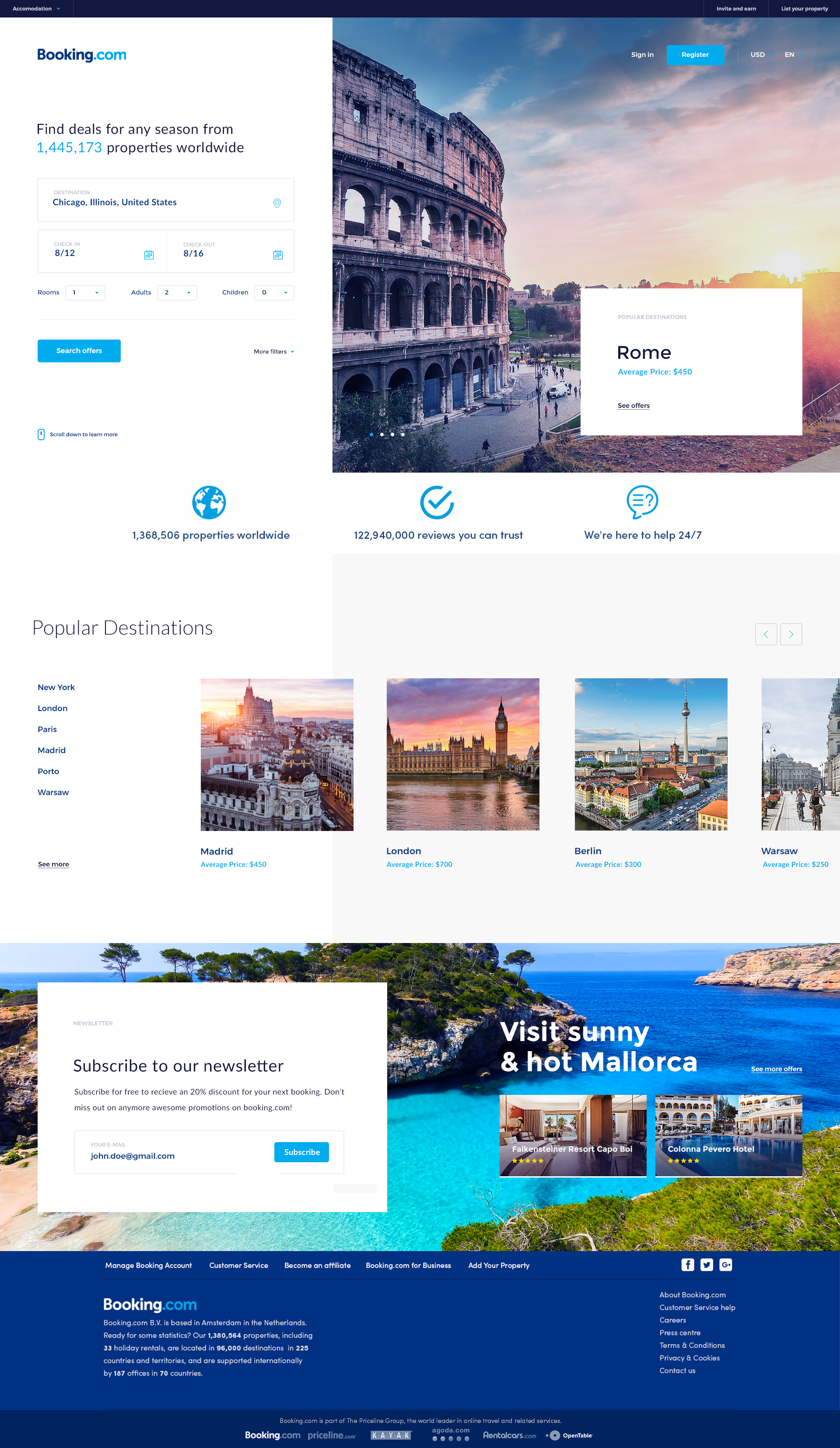
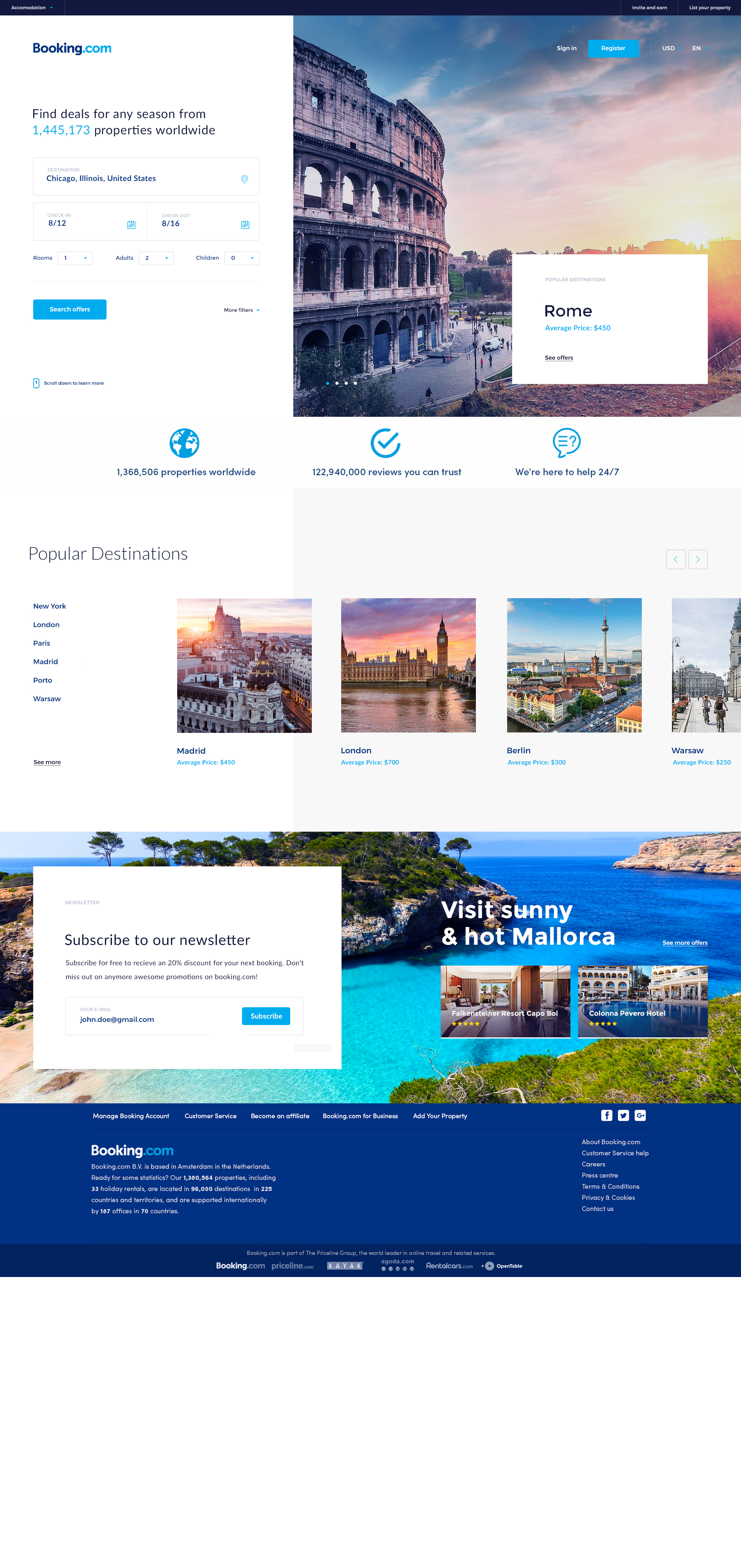
With a new information architecture, I brought the findings to life through annotated, low-fidelity and mid-fidelity designs. The intention behind this stage was to create a goal-oriented layout, based on the newly-proposed, intuitive information architecture.
Sketches are a great method to create as many alternatives of the layout as quickly as I could.
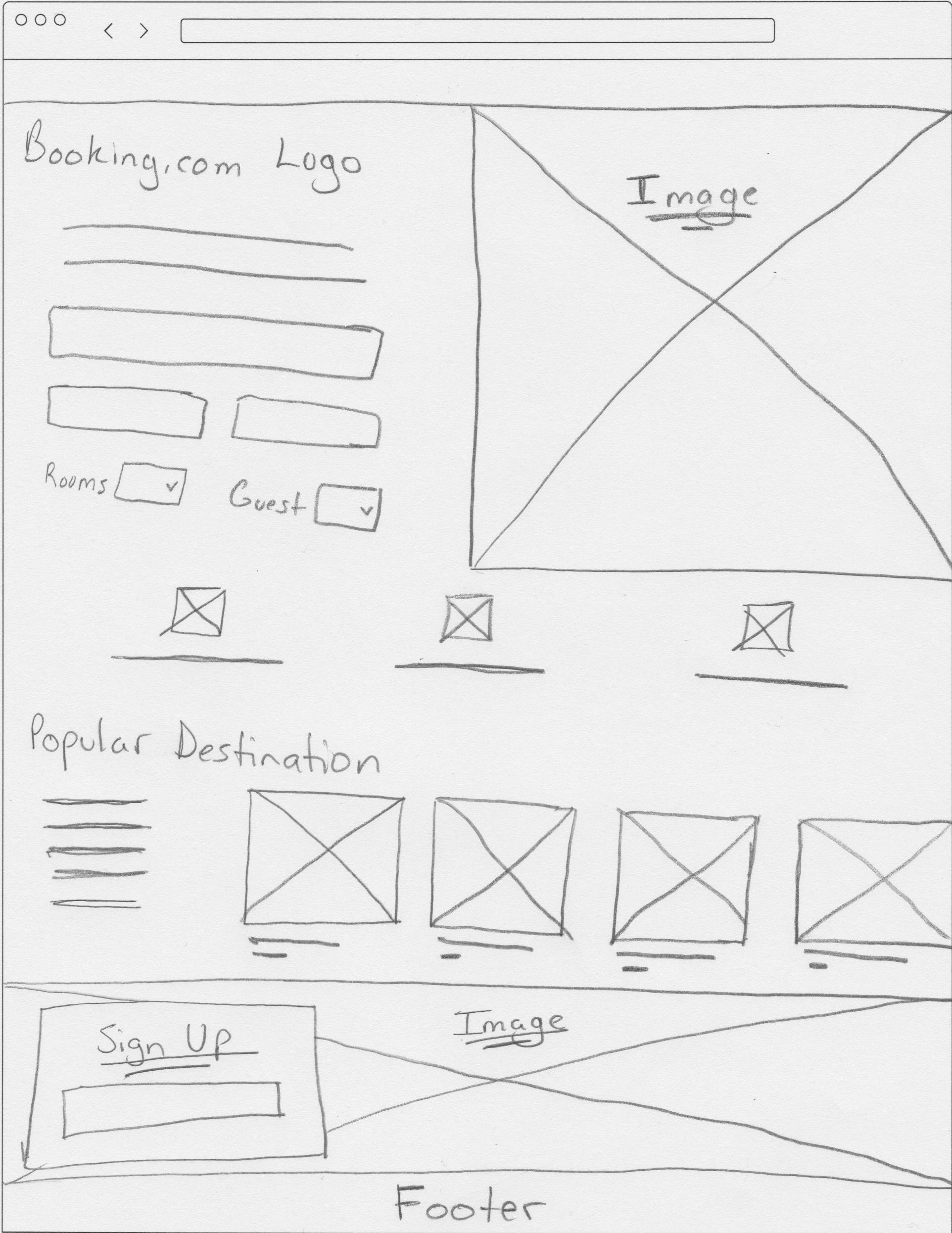
Through this constant ideations, the strongest ideas moved from sketches to wireframes using Sketch.
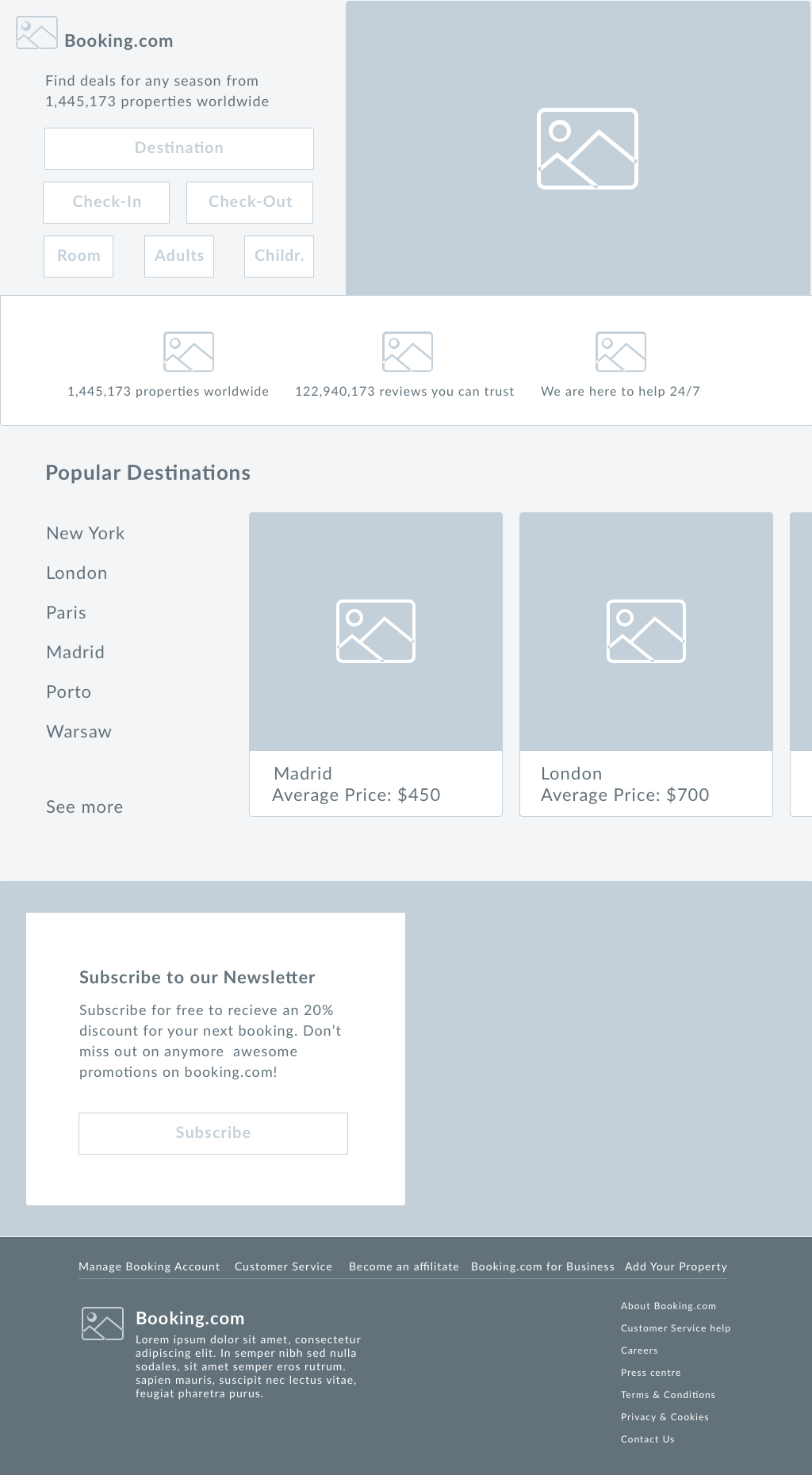
Lastly, I created a high-fidelity mock-up as the final deliverable.