
UI/UX Design
The content of this project is hidden because it is a private project. Please contact me for the password.
The CONTEXT
When a child is admitted to the hospital, parents usually accompany their child and participate in the care. Therefore, it is not only vital to acknowledge the needs of the child during care but the needs of the parents too. Parents commonly report that their primary needs are rarely met for trust, information, support, and guidance. To address this complex issue, my team and I created an app solution that provided parents with reassurance and information through proper education and communication.
The Objective
The objective of this project was to create an app solution to better accommodate families with children staying in extended pediatric hospital care, using a user-centered design problem-solving process.
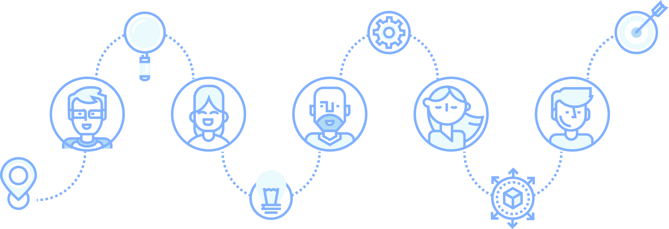
The Approach
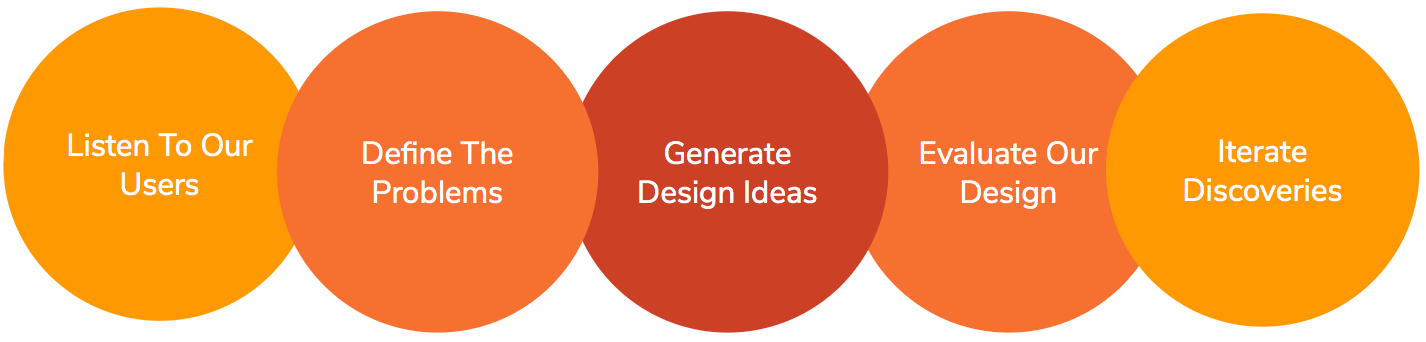
User Interviews are a way to listen to our users. It provides awareness to biased information, correct information, and more importantly, incorrect misconceptions. Our team discovered:
1) High levels of stress in this situation result in difficulties with eating and sleeping
2) Parents and caregivers worry about not being with other children and figuring out how to make sure they are taken care of
3) The financial burden of hospital bills/lost wages can weigh on the family, especially for the parents or caregivers
4) Though rare, clear and frequent communication from hospital staff provided a sense of control and security
5) Lack of communication from the hospital staff was extremely frustrating
6) Medical providers would mention that all the info families needed was online, but was always difficult to find and comprehend
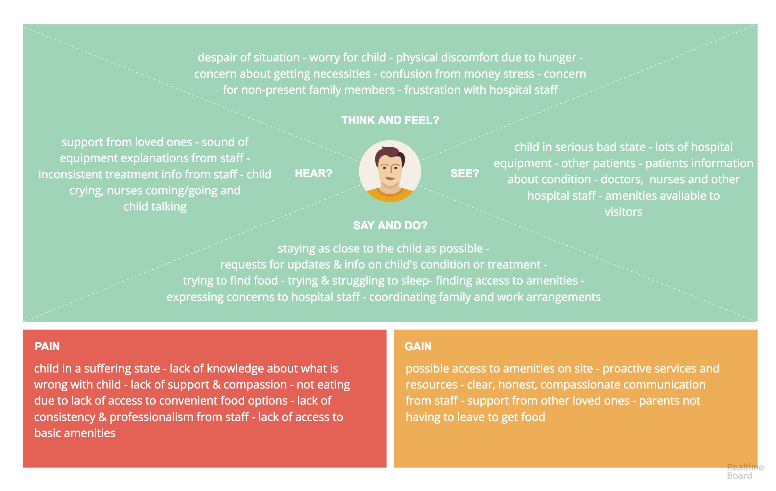
Understanding the primary pain points, I took all of the findings and created a user journey map with emotional states and annotated thoughts.
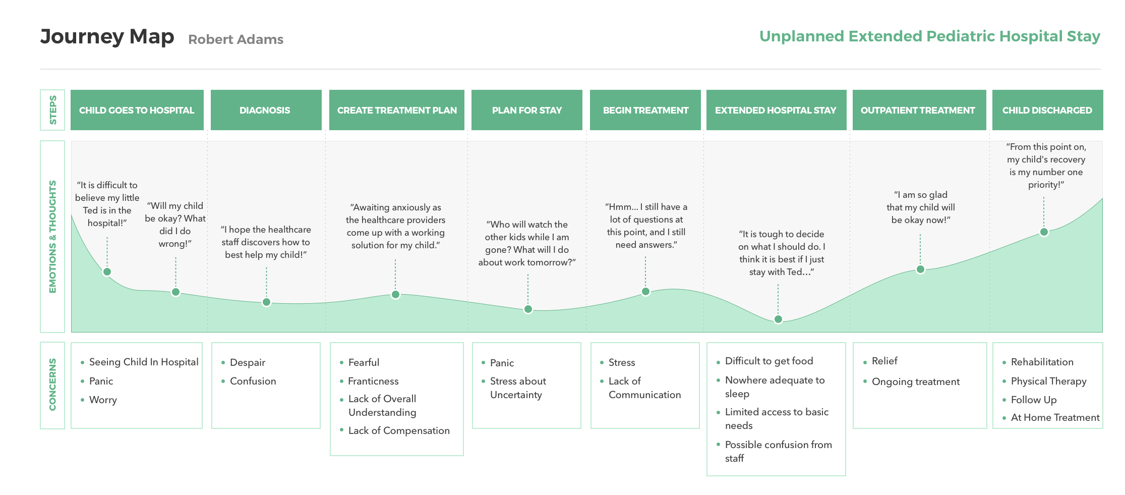
Our users felt communication with hospital staff was clearly the most distressing factor besides the state of their child. Also, when parents or caregivers have children in extended hospital stays, the hospital staff often communicates conflicting or confusing information. What we realized was:
1. Addressing this issue would help alleviate some tertiary problems. Our users would repeatedly forgo access to essential amenities (food, shower, sleep, etc.) because they were afraid if they left, they might miss an important update.
2. With a mobile-friendly place to have access to the most up to date information, we would provide a little more freedom to these families to take care of not just their child, but themselves as well.
The process of making the empathy map was quite emotionally affective as our team adopted the state of mind that one would have in such a troubling situation. At anytime we needed to remind ourselves of who we are designing for, we returned to the empathy map as a resource.
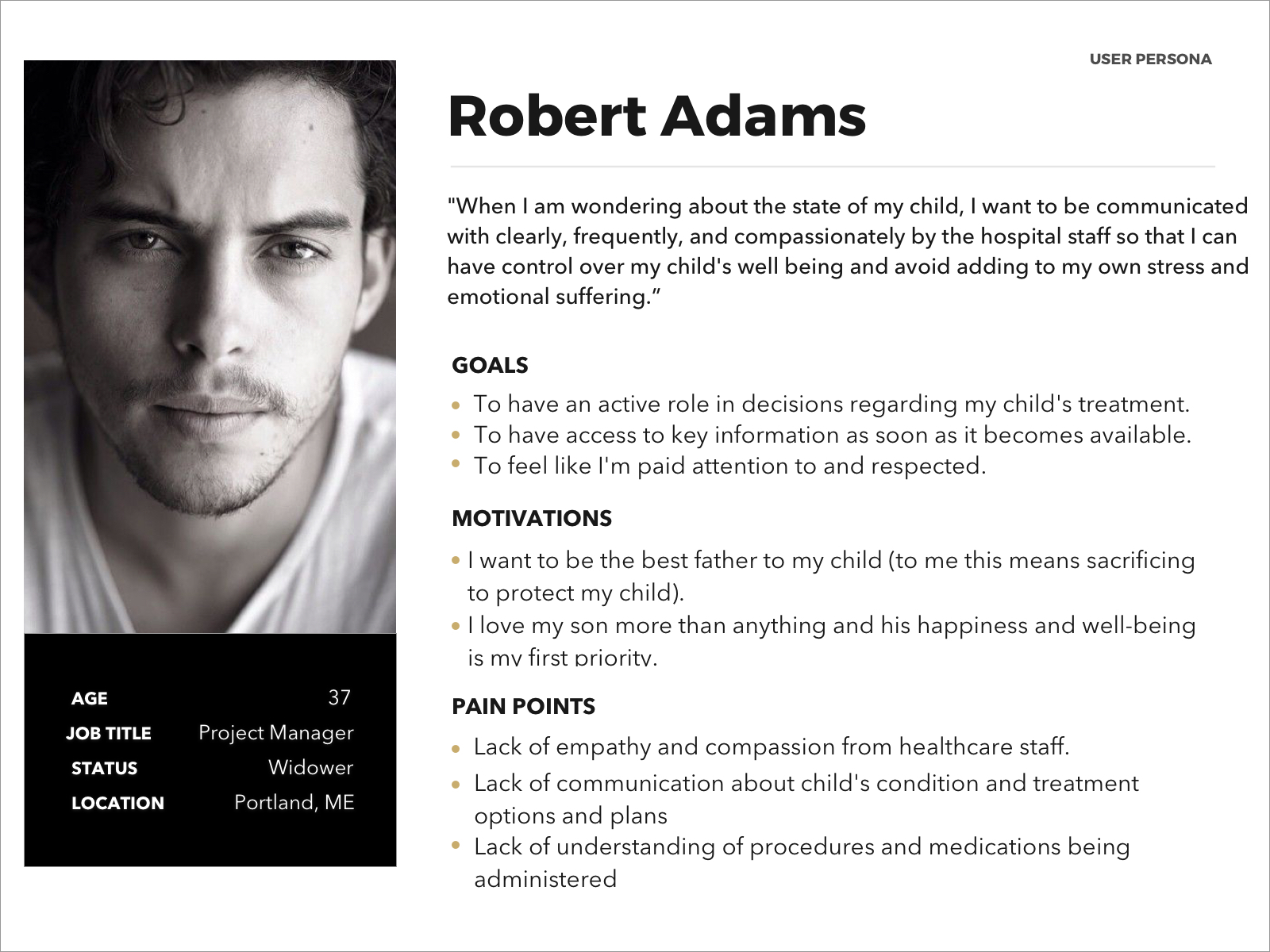
To better understand the behaviors and motivations of our users, personas were created a reliable and informative representation of our users. Being able to recall this information from our users can prove to be useful in the design phase.
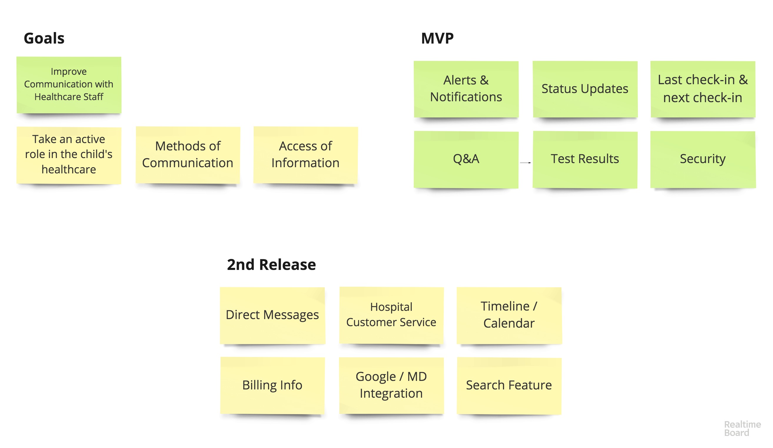
Now that our team understands who we are designing for and the specific problem we are going to solve, we can develop a map to determine the MVP and ultimately shape the features that would provide the most value to our users.
Overall, the primary functions will be:
1. The feed of information about the status of the child
2. The place to access important medical records
3. The ability to send questions to medical staff
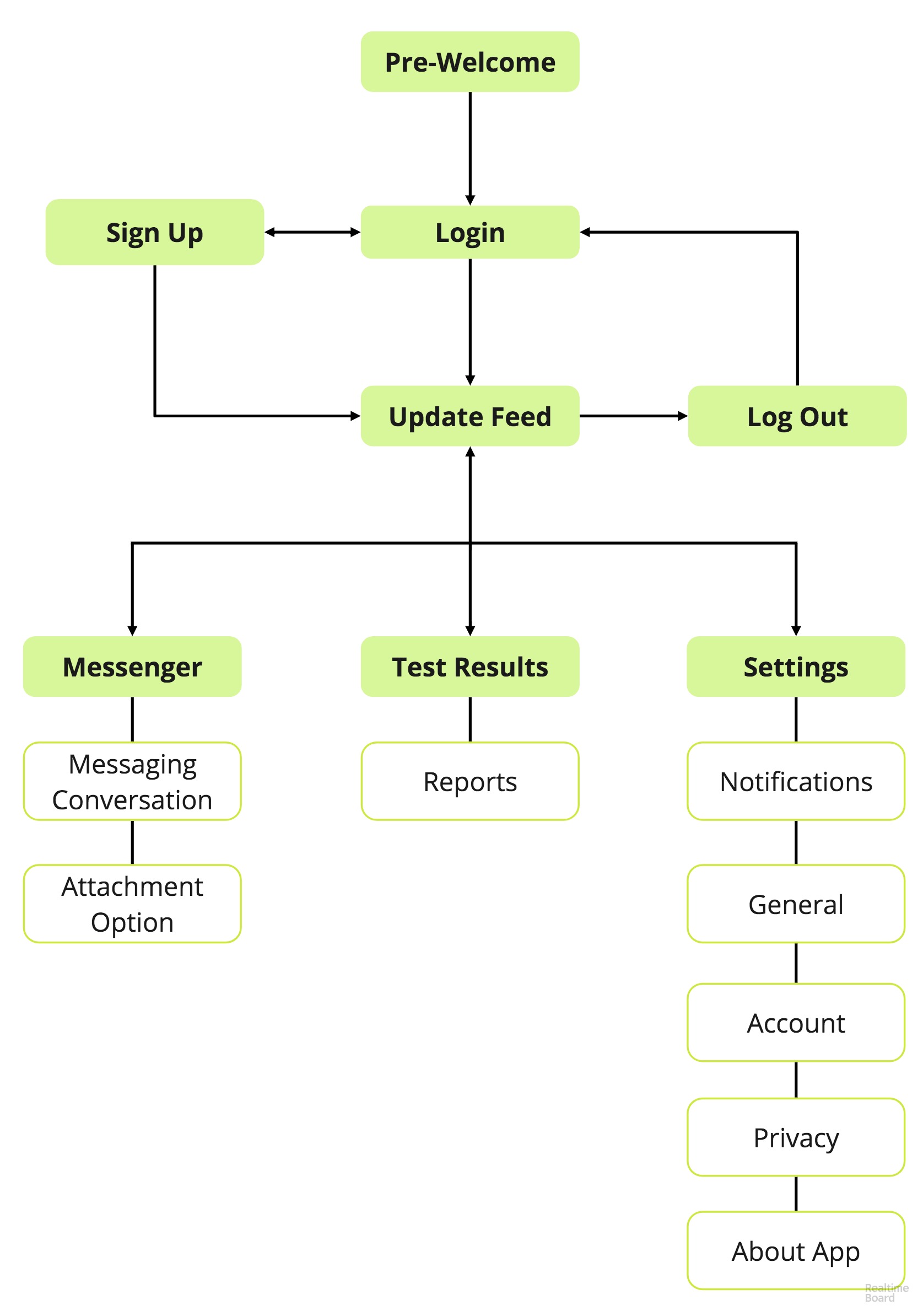
The sitemap was created to show the hierarchical structure of the app. It was used to ensure content is in places users would expect to find it.
Sketches are a great method to create as many alternatives of the layout as quickly as we could.
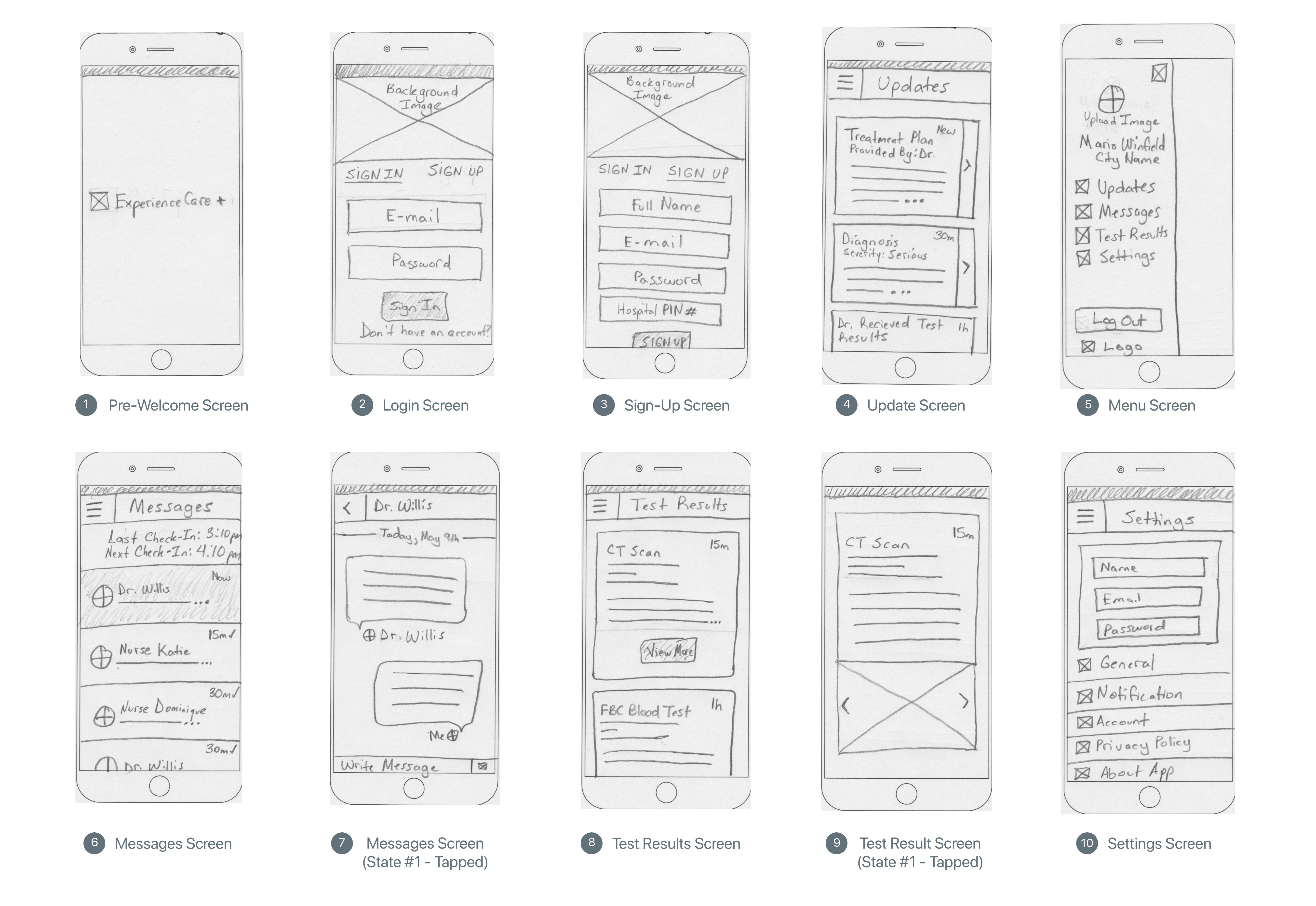
Through this constant ideations, I moved the strongest ideas from sketches to wireframes using Sketch
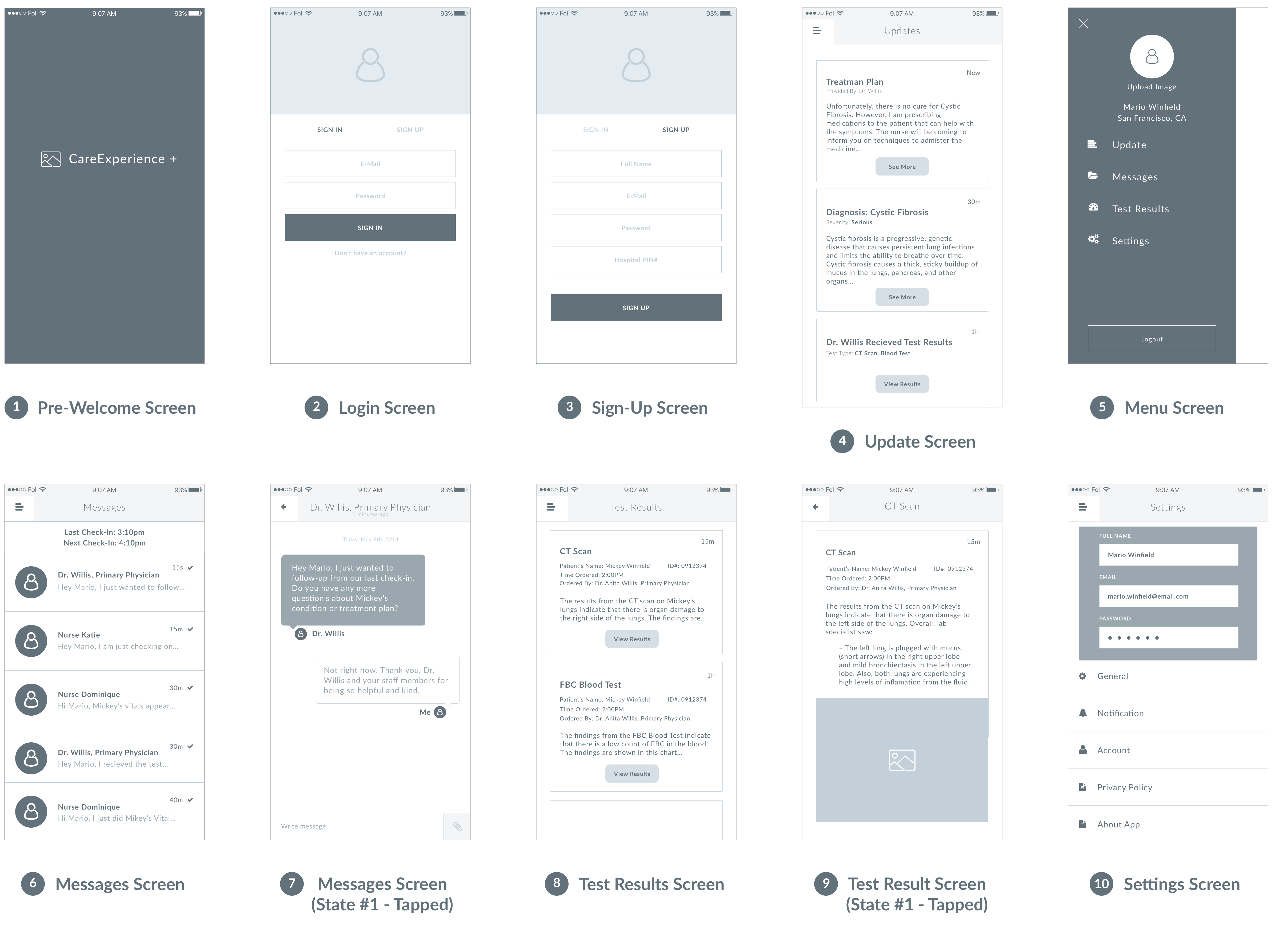
Usability Evaluations were conducted after the design process. The results from the evaluation indicated that users found the overall app effective, efficient, and satisfactory. However, users revealed a few problems in current readability in font sizes and a small area of the site's navigation.
After the usability evaluation, I iterated design changes into the next prototype. The high fidelity screens established a realistic experience to encourage useful stakeholder feedback.